Image

Description
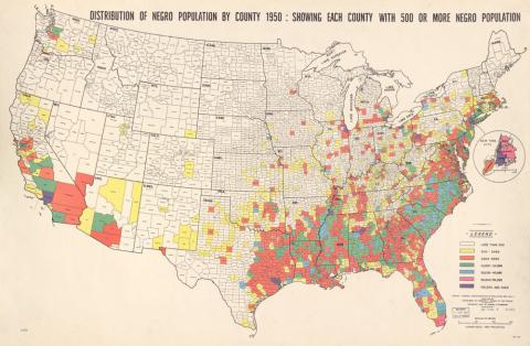
A statistical atlas by Samuel Fitzsimmons shows the distribution of the "Negro population" by each county in 1950. The counties used in the map had an African-American population of 500 or more residents.
Source-Dependent Questions
- Compare this map to the “Distribution of the Colored Population of the United States” map. What are the similarities and differences? How has the population of Iowa changed?
- What do you notice about the pink and purple counties (the most densely African-American populated counties)? Are they urban or rural?
Citation Information
Fitzsimmons, Samuel, "Distribution of Negro population by county 1950," Washington, 1956. Courtesy of Library of Congress